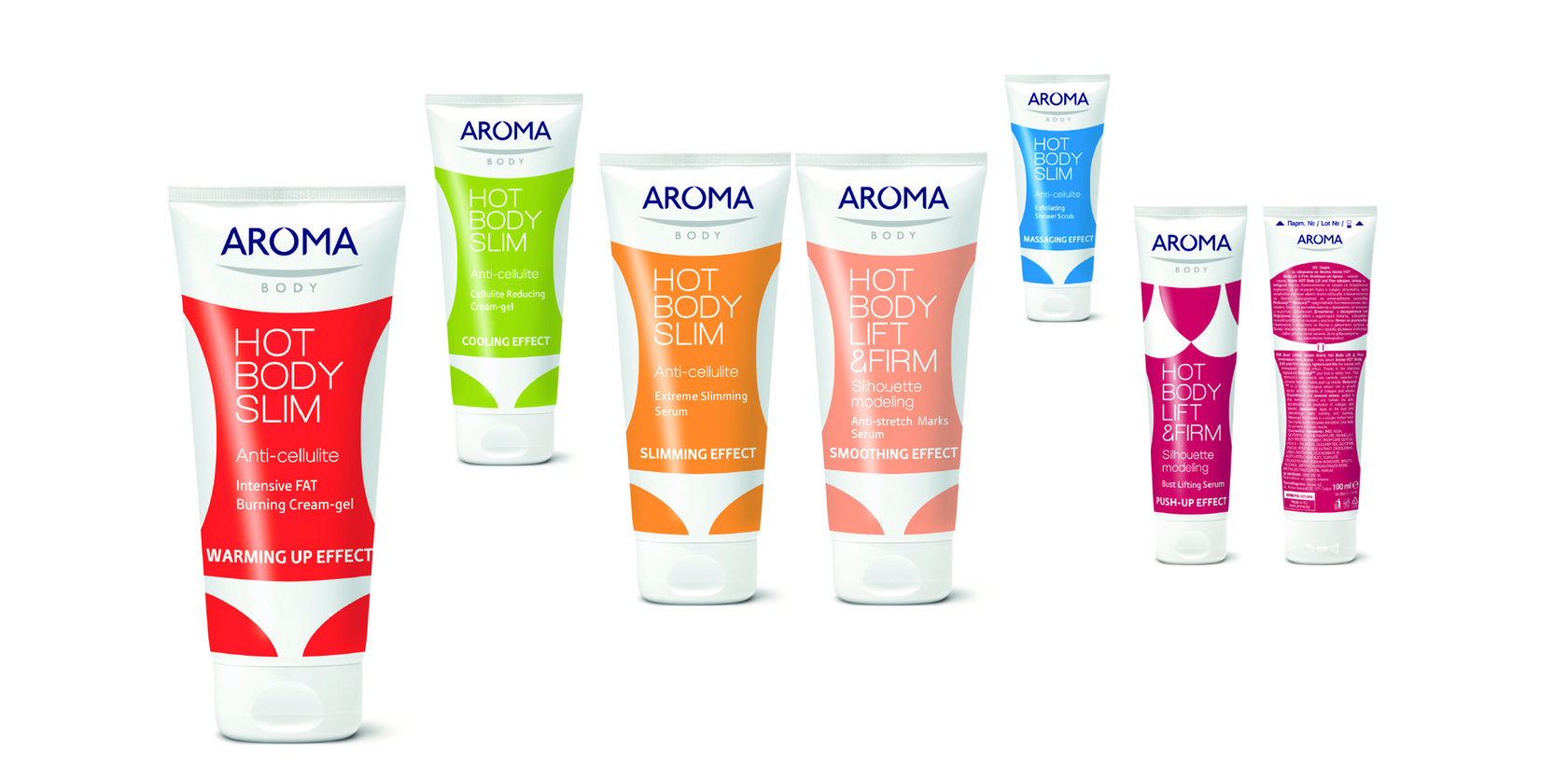
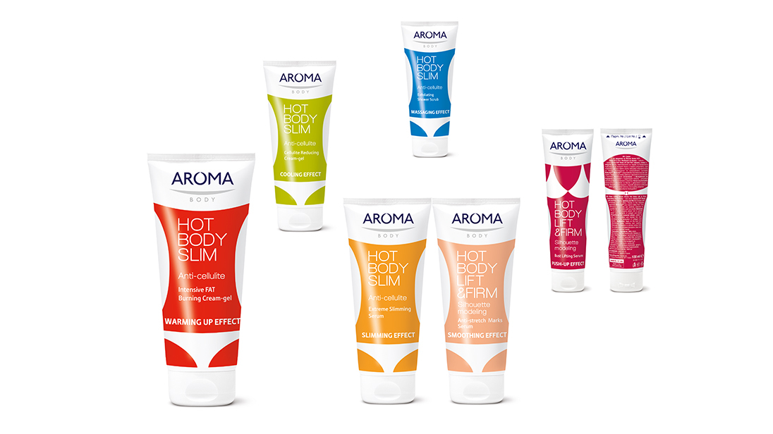
Packaging design of Aroma Body Slim


Aroma Hot Body Slim is a new innovative Aroma product series. The goal was to expand Aroma's portfolio to women 20+ users.
Design Alchemy: This series is a typical example of the role of primary and secondary packaging. On the shelf, each series struggles with its competitors to declare their fundamental and added values more authentically and visibly. Therefore, it always needs more space. Outer packaging gives these options, but it goes to the bin once it has shown the benefits of buying the product. Only primary packaging remains and lives on the shelf for a month or more in front of your eyes. We have created such an inspiring, simple and highly communicative primary packaging that will live naturally in front of its owner's dressing room, creating daily joy and meaning. The result of the design of this series was that it immensely helped Aroma change the attitude of its consumers towards an active contemporary brand.
What we did: brand identity, message design and series for secondary and primary packaging.
One of the most common challenges in dealing with mass products is structural packaging. To make it massive and affordable for consumers, companies use common packaging. The tubes we were supposed to work with, were common, and the message of the product is just the opposite - get slim! Design sends powerful and joyful messages about the action of the product, even on the back of the product.
Design alchemy
Design alchemy One of the most common challenges in dealing with mass products is structural packaging. To make it massive and affordable for consumers, companies use common packaging. The tubes we were supposed to work with, were common, and the message of the product is just the opposite - get slim! The design sends a powerful and joyful message about the action of the product, even on the back of the product. |
Design alchemy One of the most common challenges in dealing with mass products is structural packaging. To make it massive and affordable for consumers, companies use common packaging. The tubes we were supposed to work with, were common, and the message of the product is just the opposite - get slim! The design sends a powerful and joyful message about the action of the product, even on the back of the product. |
See more
Connect with us
+ 359 899 102 105
hello@studio-enthusiasm.com
Bulgaria, Sofia 1527, 138 Vasil Levski blvd
hello@studio-enthusiasm.com
Bulgaria, Sofia 1527, 138 Vasil Levski blvd


